
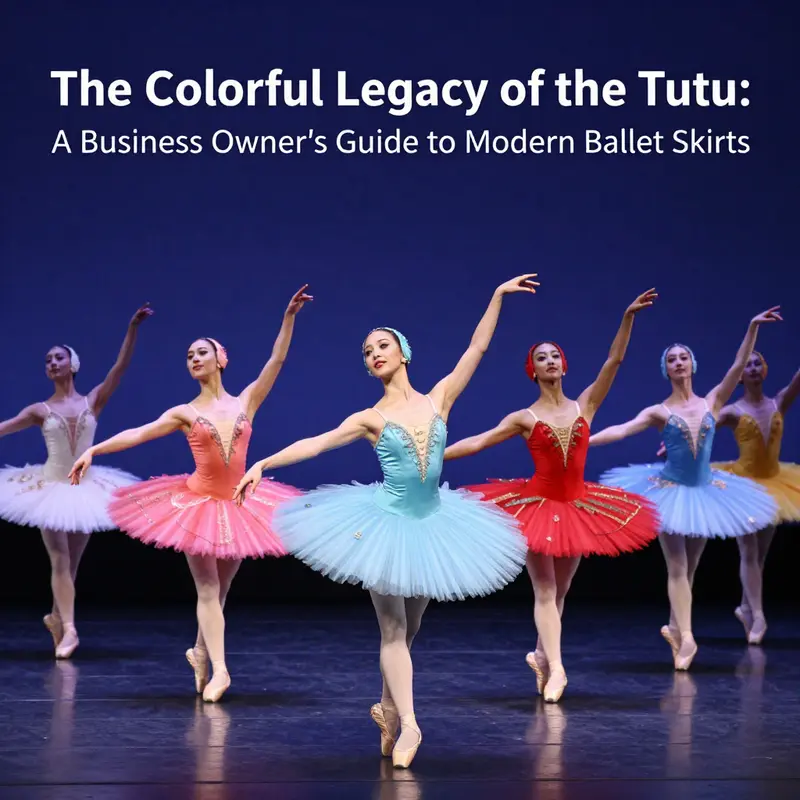
The colored tutu represents not just a staple in ballet attire but a piece of artistic heritage that bridges tradition and modernity. Understanding the rich history and evolution of the tutu can provide invaluable insights for business owners in the dance industry. From its origins in the regal courts of Europe to its current form, the tutu has undergone remarkable transformations in design, materials, and cultural significance. As performance art continues to evolve, so too does the tutu, embracing new trends and technologies. This article will delve into the tutu’s historical origins, contemporary designs, its crucial role in ballet performances, its cultural significance, and the latest innovations shaping this beloved garment.
Chromatic Silhouette: Tracing the History and Evolution of the Coloured Tutu
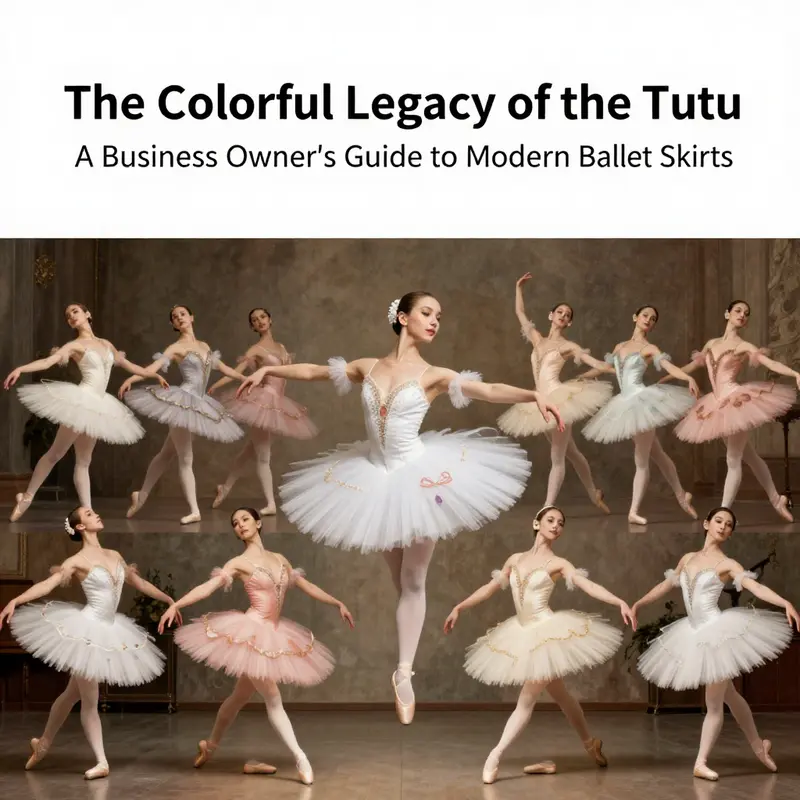
The coloured tutu arises not as a mere splash of pigment on the stage but as a decisive turn in how ballet communicates its stories. It is a vessel where color, fabric, and movement fuse to extend meaning beyond line and shape. The white, the pale, the almost diaphanous skirt long dominated the ballet imagination, symbolizing purity and an ethereal ideal that aligns with Romantic and Classical ideals. Yet as the century turned, so did the costume’s palette. The coloured tutu emerges not simply to decorate but to translate emotion, character, and narrative into a physical language dancers wear. In this sense, the evolution of the coloured tutu maps a broader arc in ballet itself: from a codified display of technique to a theatre of ideas where costume becomes a partner in choreography, a visual syntax that shapes how stories are felt by an audience. The colour is never incidental; it is a deliberate instrument through which choreographers cue mood, differentiate characters, and signal shifts in perspective, sometimes even altering the tempo of perception as light, fabric, and form interact under the stage lamps.
A useful starting point is to recognize the studio of tradition from which the coloured tutu sprang. The classic white tutu, stiff with crinoline and sheer in its delicate resonance, has its historical roots in the Romantic era’s longing for purity, spiritual elevation, and the dreamlike. In ballets such as Swan Lake or Giselle, the tutu is almost a counterpoint to the body’s natural line, a sculptural extension that elevates movement into a lyric geometry. But the 20th century, with its seismic shifts in art and society, loosened the apron strings of color and meaning. A dancer’s wardrobe began to speak in multiple tongues, and the tutu—once a symbol of restraint—could now become a chorus of character. The emergence of the coloured tutu is therefore less about abandoning tradition than about recognizing that tradition can still be grown from. It is the same silhouette, tightened and structured, but the fabric’s hue reframes what the audience knows about the dancer before they even step into the light.
One of the pivotal moments often cited in discussions of colour and ballet is George Balanchine’s Serenade from 1934. In that production, pale blue tulle skirts glowed in the dim rehearsal studio turned stage, a visible inscription of mood in soft, luminous value. The choice of pale blue did not merely decorate; it complemented the music’s texture, the way bodies moved through space, and the choreography’s breath. The ice-toned palette suggested a dreamlike quality, one that could flex with the music’s tempo and the dancers’ phrasing, allowing emotion to register through tint more than through overt gesture. This moment did more than introduce color; it demonstrated that color could be a formal decision with expressive gravity, aligned with musicality and spatial design. The colour’s effect is felt as a morphological shift: tutus become not just costumes but operating elements of the ballet’s atmosphere, capable of shifting how an entire scene is perceived by the audience.
As the mid-century advances gathered speed, so too did the confidence with which color could be deployed. Jerome Robbins, who sought to illuminate character psychology and narrative tone through a broader palette, extended these possibilities. In Dances at a Gathering, soft pastels invited intimacy and tenderness, inviting viewers to lean into nuance and vulnerability rather than to simply watch a display of virtuosity. The Concert, with its bold color contrasts, became a study in how hue could foreground comedic tension or spotlight individual idiosyncrasies within a company, turning each dancer’s silhouette into a speaking voice of personality. In these works, colour is not a decorative flourish but a flashing cue card for mood, intention, and social relationship on stage. The tutu, in its bright or muted tones, encodes shifts in power, affection, and distance, guiding an audience’s emotional arc even as the music carries the forward motion.
The late 20th and early 21st centuries saw colour become a more diversified, even experimental, element in ballet costumes. Choreographers like William Forsythe and Crystal Pite began to push against the edges of conventional silhouette, employing asymmetrical fabrics, layering, and visionary palettes that break the symmetry often associated with classical decorum. In their hands, the coloured tutu becomes a medium through which identity and social critique can be explored in a format as immediate as a dancer’s step. The hues move from being mere emotions displayed on fabric to becoming conversational partners with lighting, set design, and sound. Deep burgundies, electric greens, and monocolor gradients—alongside varied textures that catch light differently—mirror complex inner lives and contested moments in contemporary experiences. The costume thus participates in the choreography as a living, mutable layer rather than a fixed backdrop.
This broader function of colour reflects a shift in the ballet world’s self-sculpting. The art form, historically circumscribed by a white or neutral palette, begins to confront its own cultural history and its relationship to audiences who seek more inclusive representation. The coloured tutu moves beyond mere novelty; it signals a redefinition of what ballet can look like and whom it can feel for. It invites different bodies to occupy the stage with confidence, and it invites audiences to see the body in color as a spectrum of possible stories rather than a single, universal frame. In this sense, colour functions as political and ethical language as much as aesthetic choice. The tutu becomes a site where the choreographic impulse, the dancer’s intention, and the audience’s perception meet and negotiate meaning in real time. The discussion here is not simply about preference of hue but about how color informs intention, how it unlocks or constrains movement, and how it reframes the audience’s relationship to both dancer and performance.
The physical properties of the tutu also shape its evolution. Colour interacts with the stiffness of the fabric, the body’s line, and the dancer’s kinesthetic sensitivity. Early tutus used supporting materials and stiffening that could accentuate a certain sculptural profile; coloured versions added another dimension: perception under light. A shade might appear serene in one lighting cue and electric under another. The deterrent line of a white or pale tutu remains legible in darkness and glow in spotlight; but a bold hue can challenge how light travels, how shadow behaves, and how a dancer’s form reads at distance. Costume designers—whether working with traditional pale palettes or daring, saturated tones—learn to anticipate how color shifts with distance, stage direction, and the audience’s vantage point. The tutu here ceases to be a static garment and becomes a moving instrument of stage craft, constantly interacting with the choreography’s architecture, the theatre’s acoustics, and the viewer’s field of vision.
Alongside the artistic implications, the coloured tutu has become a material symbol of inclusivity and modern identity in ballet’s global landscape. As ballet companies increasingly reflect a broader range of body types, ethnicities, and cultural backgrounds, colour offers a flexible linguistic device. It provides an accessible shorthand for character, origin, or emotional state, sometimes sidestepping assumptions about a dancer’s place within a narrative and instead inviting multiple readings. The rehearsal room and the stage thus become laboratories where colour choices can be tested for inclusivity, narrative clarity, and emotional resonance. Without sacrificing the discipline and precision of technique, choreographers can rely on hue to illuminate internal states that might be missed by movement alone. In this light, the coloured tutu does not negate tradition; it extends it by inviting new audiences to see themselves reflected in the language of ballet.
The conversation about colour in tutus continues to unfold alongside changes in lighting design, set technology, and digital imaging. Modern productions increasingly exploit layered fabrics, off-kilter silhouettes, and gradient palettes that shift as a body travels across the stage. These innovations encourage choreographers to craft movement that plays with perspective, depth, and fabric physics. The tutu is thus a living mesh of narrative cues, physical constraints, and aesthetic taste—an artifact that actively shapes how dancers move and how audiences interpret those moves. The result is a ballet vocabulary that strains toward complexity, where colour is not a garnish but a foundational grammar. It is this grammar that enables a production to ride the line between the classic and the avant-garde, to honor lineage while inviting experimentation, and to keep the art form both recognizable and continuously renewing.
In reflecting on this evolution, one can observe how the coloured tutu moved from a symbolic instrument of purity to a dynamic, expressive tool for storytelling. The journey is not a rejection of the white tutu but a testament to ballet’s capacity to absorb change without losing its core discipline. It is a narrative of continuity and innovation braided together—where a dancer’s line, a light cue, and a color across the fabric become a single, interwoven sentence in the choreographic script. The coloured tutu stands today as a potent emblem of ballet’s imaginative horizon: a silhouette that can still honor centuries of technique while embracing the plural voices and perspectives of a modern stage. For students and audiences alike, it offers a reminder that color on the body can carry history, politics, emotion, and hope—an ongoing conversation written in fabric, pigment, and movement.
For readers curious to connect this historical arc with tangible examples of how colour and costume shape performance, consider the broader design traditions visible in contemporary ballet wardrobes. A notable example that aligns with this discussion and offers a sense of the material and aesthetic possibilities is the professional ballet tutu with silver and golden trims, a design that foregrounds metallic accents to cue character status and lighting responses. See the details here: professional-dance-costumes-for-ballet-silver-golden-t0470-silver.
As ballet continues to evolve, the coloured tutu remains a vivid testament to how a costume can participate in and propel an art form forward. It is a living object—part garment, part idea—continuously reinterpreted in relation to music, movement, audience perception, and the cultural moment. The story of the coloured tutu is therefore also a story about ballet’s resilience and its capacity to grow with the times, while still carrying the echo of its long, luminous past. The dialogue between tradition and innovation that it embodies is not a static compromise but a dynamic negotiation that keeps the stage alive, bright, and deeply human. External resources, including historical overviews of ballet costume and practice, offer a broader context for understanding this evolution and the ways in which colour has come to define much of ballet’s modern aesthetic. External resource: https://www.ballet.org.uk/learn/what-is-ballet/history-of-ballet
Dye, Tulle, and Spotlight: The Design and Materials Crafting Coloured Tutus
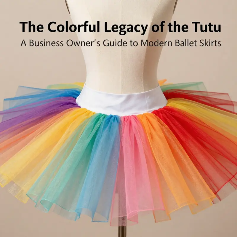
A coloured tutu blends color, fabric, and form to communicate mood and movement.
The silhouette supports legibility of line while colour signals narrative intent. Tulle, typically polyester or nylon, provides translucence and volume; layered tulle creates depth so a single hue reads clearly on stage. Finishes like iridescent or pearlescent coatings expand the palette as lighting shifts.
Layering techniques allow gradients or color blocks that cue transitions in the choreography. Modern innovations include embedded lighting within the skirt, using lightweight LEDs tucked between layers and powered by a compact battery pack. Such effects must be balanced with weight and balance to keep the dancer free. Custom dyeing and careful dye absorption ensure bespoke colorways, while precise finishing keeps saturation even as the dancer moves. The result is colour that remains legible from every seat, even as the dancer turns and leaps across the stage.
Chromatic Couture on Stage: How Coloured Tutus Shape Ballet’s Narrative and Emotion
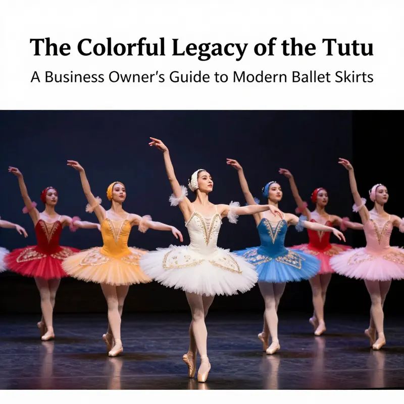
In rehearsal rooms and onstage at key moments, colour is more than decoration; it is a language that speaks when words fall silent. A coloured tutu communicates before a dancer moves, signaling mood, allegiance, even the arc of a character’s inner life. It is the first line of dialogue in a choreographic conversation between lighting, set design, movement, and audience perception. This chapter treats coloured tutus not as mere accents but as integral instruments of storytelling, capable of bending the emotional weather of a performance and guiding an audience through shifts in time, space, and empathy. Where white or off-white tutus have historically anchored classical narratives with an aura of purity and restraint, coloured tutus introduce a spectrum of intention that opens the choreographic imagination to nuance, contrast, and risk.
The shift from laconic white to deliberate colour across ballet repertoires is not simply a fashion update; it reflects evolving strategies in how narratives are built and felt. A vivid red tutu, bright as a sudden heartbeat, can magnetize attention and encode urgency, passion, or peril. A soft pastel, by contrast, can cradle a moment of innocence, fragility, or ethereal beauty. These associations are not fixed rules but working hypotheses that choreographers test against the music, the architecture of the stage, and the psychology of the characters. In this sense, colour becomes a dramaturgical tool. It sets expectations, nudges perception, and subtly invites the eye to follow a line of motion that might otherwise be overlooked.
In contemporary ballets, designers and choreographers push colour toward the edge of convention. And here colour serves not as a garnish but as a provocative agent. Renowned contemporary voices in ballet have used bold hues to challenge inherited norms, foregrounding individuality and emotional intensity. The result is a more granular emotional map. The audience experiences not a single arc of narrative but a tapestry of micro-emotions, each hue acting as a node in a larger network of feeling. When colour feels purposeful rather than decorative, it dignifies the dancer’s body as a moving archive of mood, memory, and motive.
Color’s function is often relational. It helps differentiate characters in ways that speak to social roles, status, or even the texture of a relationship. In Coppélia, the toy-world energy of the piece is reinforced by costume design that uses bright, patterned tutus to emphasize the doll-like artificiality and whimsical mechanical movement that define the world. The hues become part of the joke, part of the illusion, and part of the psychology of desire and imitation. In La Sylphide, palette choices—sometimes understated greys and blues—underline the supernatural and the Romantic longing that pervades the ballet. The silvery blues of the sylphs’ tutus are not accidents; they are deliberate sonic textures for the stage, aligning colour with air, memory, and the ache of unattainable beauty. These choices demonstrate how colour can translate intangible psychological states into visible form, offering the audience a shorthand that deepens the work’s resonance.
The technology behind contemporary colour in tutus has expanded the horizon for designers. Advances in textile science have yielded fabrics that endure the rigours of stage lighting while staying vivid under hot spots and long performances. Synthetic fibres, resilient to wear and fading, allow designers to push more saturated palettes without compromising durability. Digital printing and dye techniques enable intricate patterns, gradients, and subtle colour shifts that follow a character’s arc. A tutu might begin in a deep, shadowed hue and gradually brighten as a narrative triumph unfolds, or it could recede through a controlled scale of colour to reflect a character’s fall from grace or retreat into memory. This capacity for dynamic colour adds a cinematic dimension to live performance, where the gaze is free to wander and the costume’s chromatic journey mirrors the dancer’s evolving internal landscape.
The choreography-costume relationship is a symbiosis. Lighting designers sculpt colour with intensity and direction, while set elements offer complementary or contrasting backdrops. A bright tutu can dance against a monochrome stage, a fortissimo silhouette against a muted wall, or melt into a sunset gradient projected across the wings. The result is not a static snapshot but a living mural, where the tutu’s hue shifts meaning as the music swells, the tempo accelerates, or a principal character undergoes transformation. The audience reads the colour as both sign and signal—the visual heartbeat that accompanies breath, weight, and momentum. In such moments, the tutu ceases to be costume alone and becomes a co-creator of atmosphere and intention.
Historically, the colour palette of a ballet’s costumes often reflected its cultural or narrative milieu. Yet coloured tutus also travel across borders of genre and expectation, inviting hybrid sensibilities. In some modern works, a single production can move through a spectrum of colours, each act or scene representing a different emotional climate or thematic shade. The audience, too, is invited to decode, not just observe. This decoding becomes part of the choreography’s cognitive life: viewers map colour trajectories to the dancers’ trajectories, linking perceptual cues to emotional turns. The act of watching thus becomes an interpretive exercise—one in which colour directs attention, frames action, and nourishes memory.
If colour is a narrative instrument, then character design is its score. Costumes must harmonize with the dancer’s technique and the performance’s tempo while staying legible to an audience that may only briefly glance at a costume before the next step, lift, or pirouette. This is why designers often pair colour with cut, texture, and silhouette as a single, integrated language. A tutu’s stiffness and flare—the signature of the classical silhouette—remain essential. Yet the way colour interacts with that silhouette changes the silhouette’s emotional vocabularies. A stiff, saturated red tutu might feel combative and kinetic, reinforcing brisk, angular movements; a softer, pearly pink could soften lines and invite a more lyrical, buoyant phrasing. In this way, colour and cut collaborate to reveal a character’s interior life and to cue the audience to shifts in power, desire, and consequence.
The education of taste and intention in colour is also an invitation to cross-cultural resonance. In ballets that travel internationally, designers may adapt colour cues to align with local associations or to create a universal readability that transcends language. A red tutu can signal danger or passion in one cultural frame and emerge as a rebellious spark in another. A blue-grey tutu might anchor a melancholy, almost mythic mood that travels well across continents. The capacity for colours to carry story across cultures reveals their potential to unify diverse audiences around a shared emotional experience, even while preserving distinct choreographic identities.
A practical example lies in the way designers reference archival imagery while pushing contemporary boundaries. The classic white or ivory tutu, long associated with reverence and purity, anchors many audiences in a familiar tradition. When colour enters, it is not a rejection of that tradition but an expansion of its expressive field. One can imagine a reference point in which the elegance of a white tutu is preserved in specific moments of a production, while bold colours enter at pivotal narrative junctures to signal shifts in mood or sector of the story. For those who study costume history, coloured tutus offer a living laboratory: they show how tradition can bend toward invention without losing the integrity of the form.
The design process itself mirrors a lyric journey. It begins with reading the script, listening to the score, and sketching mood boards that map colour to emotion. Designers then collaborate with lighting, set, and the dancers to test how a chosen hue travels across a stage, how it looks in different angles of light, and how it reads from the far seats in the orchestra gallery. Prototypes are tested under rehearsal lighting, where the colour is judged not just by its beauty but by its legibility and emotional force during movement. Fabrics are weighed for weight, stiffness, and drape; colours are refined for dye fastness and consistency across productions. The final tutu becomes a compact theatre of possibilities, capable of evolving with the choreography while remaining rooted in the performer’s line.
In discussing this topic, it is worth acknowledging how readers and audiences engage with colour in theatre at large. Colour heightens emotional attunement and can accelerate the storytelling tempo by offering immediate cues. As viewers, we may not be consciously cataloguing each hue, but our bodies respond to the tonal landscape. An audience can experience a scene not just through the dancer’s physicality but through the emotional resonance of the costume’s colour, which acts as a second, subtler performance that runs parallel to movement. This layered experience is what makes coloured tutus so powerful: they operate on multiple perceptual levels, guiding attention while deepening sympathy, tension, or release.
To illustrate the integration of historical craft with modern experimentation, consider the enduring pull of a white-tinted baseline paired with a spectrum of colour in a single production. In such a setup, the White Swan-style lineage anchors the piece, while a chorus of colour accents enables poetry in motion. The garment’s stiffness, designed to flare from the waist, retains its iconic silhouette even as colour shifts become the narrative’s heartbeat. In practice, this means a tutu can morph in the audience’s perception from a symbol of purity to a vessel of passion, danger, or wonder, depending on the moment’s need. The choreography and the costuming become a single dialect, and colour is the most fluent verb in that dialect.
For readers exploring how these ideas translate into real-world practice, a concerted look at contemporary costume design offers rich context. The Guardian’s coverage on ballet costume design explores how creative expression now travels through materials, digital processes, and collaborative workflows, a landscape where coloured tutus sit at the intersection of artistry and technology. This broader perspective helps illuminate why designers push colour beyond cliché and how such choices feed the audience’s imaginative engagement. For further reflection, see this insightful overview: https://www.theguardian.com/culture/2023/jul/18/ballet-costume-design-creative-expressions.
As a practical point of reference within the wider catalog of ballet costumes, audiences and students alike can examine how a singular white baseline might coexist with a suite of colours. A striking way to connect with this is to observe or study tutus that pair a pristine foundation with vibrant overlays or gradients. The result is not merely visual delight; it is a carefully calibrated narrative instrument. A single tutu becomes a palette of emotional states, a wearable score that can be read as a map of the protagonist’s journey—from uncertainty to discovery, from restraint to release. In this sense, coloured tutus carry forward a lineage while pushing into new dramaturgical territory, proving that colour, properly harnessed, can enrich even the most venerable ballet traditions.
The dialogue between colour and movement remains at the heart of this exploration. When choreographers invite colour to perform with the dancers, they invite the audience to participate in a more intimate, layered reading of the story. The tutu is no longer simply a costume; it is a dynamic partner, subtle and decisive, shaping the tempo of perception as surely as the music shapes rhythm. It is precisely this synthesis—between craft, technology, and narrative intention—that keeps coloured tutus vital to the evolving language of ballet. In a field that continually negotiates between heritage and innovation, colour emerges as a robust instrument for storytelling, capable of guiding memory, eliciting emotion, and inviting fresh interpretation with every performance.
Internal reading and practical examples can illuminate these ideas further in the context of existing repertoires and educational resources. For audiences curious about specific colour and cut combinations that preserve classical line while embracing modern sensibility, consider exploring a modern white-on-white or coloured-on-colour pairing within archival or educational frames. Within this broader inquiry, the visual vocabulary of the tutu offers a practical gateway: how hue, texture, and silhouette collaborate to reveal character and narrative arc. The tutu remains a symbol, a tool, and a catalyst for movement—a reminder that colour, far from being decorative, is a core language of ballet.
External resource: https://www.theguardian.com/culture/2023/jul/18/ballet-costume-design-creative-expressions
Shades in Motion: The Cultural Language of Coloured Tutus Across Ballet and Beyond
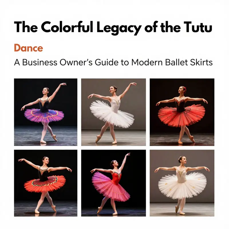
A colored tutu is more than a splash of hue on a dancer’s silhouette; it is a careful instrument of narrative, emotion, and cultural dialogue. In the quiet tension between pale classical purity and the electric pull of color, the tutu becomes a living symbol whose meaning shifts with choreography, lighting, and audience expectation. The traditional white tutu, stiff and frontal, has long stood as a visual shorthand for the classical ideal—an ethereal, nearly incorporeal presence that aligns with the repertoire’s most revered female archetypes. It is a silhouette that has traveled with ballets like Swan Lake and Giselle, projecting purity, grace, and a certain impossible lightness. Yet color introduces a different grammar. When a skirt is dyed not to soften but to signify, the dancer’s story becomes accessible in a more immediate, visceral register. The color carries memory, mood, and intention at a glance, and unlike set or gesture, it is a first, frontal language that audiences read before words are spoken or steps are taken. In this sense, the colored tutu is a flexible tool for storytelling that can honor tradition while opening doors to new meanings and identities within both ballet and contemporary dance.
The turn toward colored tutus represents a shift in artistic expression that mirrors broader conversations about representation, inclusivity, and the reimagining of canonical forms. A red tutu may announce danger or passion without requiring a single spoken line; blue can conjure melancholy, mystery, or otherworldliness, while green might evoke vitality or nature’s resilience. These associations are not universal, but they gain power through repeated pairing with choreography, dramaturgy, and lighting design. As choreographers experiment with new ways to tell old stories, color functions as a visual cue that helps the audience follow a character arc across scenes that might otherwise feel amorphous. In this way, colored tutus expand the potential for emotional clarity in performance, offering a shorthand that can compress complex internal states into a single, accessible image on stage.
This evolution also signals a broader cultural moment. The arts have become more attentive to diverse identities and experiences, and costume—long a site of tradition—has become a medium through which artists negotiate that diversity. A colored tutu can serve as a visual address for audiences who are hearing new voices in what was once a very narrowly defined historical conversation. The result is not a rejection of classical ideals but a recontextualization: a way to honor the discipline’s precision while inviting audiences to see themselves reflected in the performance. The color palette chosen for a production can echo or contest the choreography’s emotional spine, aligning with contemporary sensibilities about visibility and belonging. In this sense, the colored tutu becomes a cultural signal, part of a language that dancers, designers, and audiences co-create through performance.
In practice, the shift is not merely about choosing brighter fabrics. It requires a careful alignment of color with movement, lighting, and stage space. A red tutu, for instance, can intensify a moment of confrontation when lit from side angles that throw the fabric into sharp relief against a darkened auditorium. A blue tutu might glow with an almost lunar coolness under cool-toned lighting, suggesting a dreamlike detachment or a tale set in a different climate or realm. Choreographers and costume designers collaborate to ensure that color does not overwhelm form but rather enhances it—connecting the dancer’s line, the silhouette’s architectural crispness, and the spatial rhythm of the ensemble. The stiffened fabric that gives the tutu its iconic flare remains essential; it keeps the silhouette legible at speed and distance, but now the fabric’s color works in concert with the body’s translation of music into motion. The result can be a more legible narrative for audiences who bring varied cultural frames to the theatre, helping and sometimes challenging them to interpret emotion and motive through color as much as gesture.
The conversation around colored tutus also intersects with questions of access and representation. In contemporary and modern dance, where personal identity and storytelling often carry forward the idea that form must serve truth, color becomes a signal of availability and welcome. A dancer who has long seen herself reflected in white, classical forms may discover new resonance when a performance offers a palette that feels more like her own world. In practice, designers may choose bold colors or nuanced pastels to reflect a dancer’s character or to signal a shift in the narrative’s tone. These choices can empower performers by giving them a broader range of self-expression and inviting audiences to experience a character’s interior life through something as immediate as a color choice. The effect is a democratization of the stage, where color acts not as ornament but as a medium for identity and meaning, allowing performers from diverse backgrounds to see themselves in a tradition that remains, at its core, a shared language of movement.
Color’s political weight should not be overstated, but it is worth acknowledging how a palette can carry social resonance. In performances that aspire to social consciousness or cultural dialogue, colored tutus can foreground themes of transformation, resilience, and renewal. The way a color is chosen—whether it aligns with a specific cultural reference, echoes a contemporary fashion mood, or deliberately resists a conventional expectation—can foreground a narrative of inclusion without sacrificing technical rigor. In this way, the tutu’s color becomes a beacon for both memory and possibility: memory of a storied repertoire and possibility for future iterations that are more inclusive and reflective of a global audience. As audiences become more attuned to the layers within a performance, color-based storytelling invites a broader conversation about how art can reflect who we are and who we might become when tradition makes space for difference.
The dialogue between color and choreography is not confined to the proscenium. It travels through rehearsal rooms, design studios, and touring productions, where the practicalities of colorfast fabrics, lighting coordination, and stage management intersect with the aesthetic and symbolic aims discussed above. A colored tutu must perform as reliably under a range of lighting conditions as a white one does under classical illuminations. It must endure the rigors of touring and the demanding rhythms of rehearsal schedules without losing its shape or color integrity. In this sense, color in the tutu is both a creative decision and a logistical commitment—an assurance that the dancer’s expressive intent remains legible from back row to balcony, even when the house lights dim and the orchestra swells. This marriage of artistry and practicality is part of what makes the colored tutu a living artifact of evolving taste and technique in dance, rather than a simple momentary fashion statement.
The broader cultural ramifications extend to pedagogy and the cultivation of next-generation dancers. In training spaces, the introduction of color as a storytelling device can help students articulate emotion with more nuance. Where a white tutu might demand an emphasis on line and control, a colored tutu opens avenues for exploring character, mood, and narrative intention through hue as well as gesture. In turn, teachers, choreographers, and designers collaborate to ensure that color choices support a durable technical foundation, so that expressive goals never outpace the dancer’s disciplined craft. The result is a more inclusive educational environment where young artists can find a path that resonates with their personal histories while still engaging with the discipline’s timeless precision.
For readers curious about the practical and symbolic dimensions of costume all at once, a vivid case appears in productions that blend classical figures with contemporary color palettes. The choice to clothe a character in a pink tutu, for instance, can evoke whimsy and tenderness while simultaneously signaling a narrative pivot that challenges traditional gendered or aesthetic expectations. The interplay of pink with gold trims or silver accents can suggest a ceremonial or fairy-tale mood, tying together lineage and invention in a single visual sweep. Such design decisions illuminate how the colored tutu operates as a conduit between the audience’s memories of familiar stories and the evolving language of modern performance. Through these direct, observable cues, color becomes a way to connect generations of viewers to the stage—the bridge between historical form and living practice that keeps dance both anchored and alive.
Within this ongoing conversation, one can observe how a single design choice can ripple through an entire production. The color palette aids in character differentiation within large ensembles, clarifies relationships in moments of tension, and frames climactic revelations. It also invites a broader, cross-cultural conversation about how visual symbolism travels beyond the Western canon, drawing from global fashion and theatre traditions to enrich the stage language. The colored tutu thus becomes a humble yet potent instrument of storytelling, one that remains faithful to technique while inviting new audiences to participate in the interpretation of movement as meaningful, communicative art. As dancers press into the next generation of repertoire, color will likely continue to evolve as a mutable language—one that listens to audiences, reflects changing identities, and affirms the enduring power of the body in motion.
For those who wish to explore a concrete example of how pink-toned costuming has been deployed in well-known repertory—a case that foregrounds both color and classical form—see the pink-tutu illustration linked here: classical-ballet-tutu-pink-costumes-golden-trims-nutcracker-cost-effect-t0469. This instance embodies how a single hue can anchor a moment in a story while still inviting interpretation and dialogue across generations of dancers and audiences. While the precise production history and costume engineering work behind such a choice are complex, the visible effect on stage is straightforward: color clarifies mood, reinforces character, and invites viewers to read a performance through multiple layers of meaning. As readers move beyond this specific example, they will find that other colors—whether in Don Quixote’s bold donning or in more abstract, non-narrative contemporary works—perform similar tasks: to foreground difference, to invite empathy, and to remind us that color, like movement, is a language we learn together.
If you wish to situate these observations within a broader discourse on ballet costume, a carefully composed overview can be found in reputable cultural commentary that treats these garments not simply as wardrobe but as a cultural artifact. For a broader discussion on the changing meaning of ballet costumes, see the BBC Culture piece on this topic: https://www.bbc.co.uk/culture/article/20231017-the-meaning-behind-ballet-costumes. This external resource offers context for how costumes reflect shifts in aesthetics, ethics, and audience expectations across different eras, helping readers situate colored tutus within a longer historical arc while also appreciating their contemporary relevance. The colored tutu thus stands at a dynamic crossroads where tradition, innovation, and cultural dialogue converge, inviting dancers to tell old stories in new ways and inviting audiences to hear those stories anew through the language of color.
Chromatic Motion: The Rise of Coloured Tutus as a Narrative Language in Contemporary Ballet
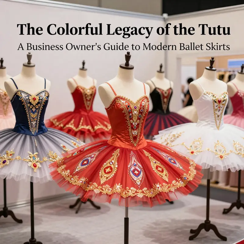
Color has long been a companion to movement in ballet, but the coloured tutu is now more than a decorative accent. It has become a dynamic instrument that guides perception, signals shifts in character and mood, and even informs the social atmosphere of a piece. The white tutu remains a touchstone in classical works, anchoring tradition, but today color is invoked with purpose and clarity. Choreographers and costume designers harness hue as a communicative layer that engages audiences in a dialogue with the dancers. The coloured tutu embodies a broader turn in ballet where form and meaning intertwine, where silhouette remains instantly recognizable but the palette expands the vocabulary of the stage. The result is a choreography of color itself that can compress psychological states, narrative arcs, and ensemble dynamics into a single signal.
This shift sits in negotiation between tradition and invention. The white tutu stands for purity, technique, and lineage, yet color offers a new language for storytelling aligned with contemporary dramaturgy. Bold reds may signal desire or danger, blues can evoke melancholy or otherworldliness, inviting viewers to sense shifts in reality as the company moves through space. Colors are chosen to resonate with music, tempo, and character psychology. A deep hue may invite the audience to read a scene at a glance, before the narrative is fully spoken.
The contemporary tutu becomes a canvas where body, fabric, and light collaborate. Advances in fabric and dye enable crisp silhouettes and durable color under varied stage lighting. Colorfast dyes ensure reds stay bold, blues stay lucid, and gradients retain transitions from rehearsal to curtain call. The tutu thus merges performance durability with chromatic storytelling and opens the door to layering color with texture and light to conjure atmosphere with precision.
Digital printing and new dye technologies allow gradients and micro patterns to be woven into fabric. A tutu may begin with a cool hue near the waist and shift to a warmer tone at the hem as gesture unfolds, mirroring character development or shifts in time. These effects blur the line between costume and stage design, inviting audiences to experience a more layered world where color acts as an active element of storytelling.
Among practitioners, the work of Crystal Pite is notable for using hue to reflect psychological states and collective dynamics. In works such as The Seasons Canon, tutu colors contribute to rhythm and tension, transforming groups of dancers into a living landscape where color maps social relations as surely as body language does. The result is a vocabulary that the eye can read quickly and then explore in depth as music and gesture unfold.
Collaborations between major companies and fashion designers have further shaped this trend. Companies like Royal Ballet and New York City Ballet have commissioned designers who bring avant garde sensibilities to the theatre, elevating the tutu from a functional garment to a theatre object that contributes to meaning on stage. Color is deployed to support narrative intention rather than merely decorate movement, guiding perception through coordinated color, silhouette, and light.
For students and practitioners, color can be read as a form of choreography in its own right. Tutu colors become a conversation with choreography, lighting, and staging, with palettes evolving with the production’s arc. Such decisions require collaboration across lighting, set design, and direction, yielding a holistic experience where color shapes time, space, and emotion on stage.
This chapter also touches on the broader discourse around color and identity in contemporary dance. Commentary in major outlets reveals how designers use hue to interrogate character and social relationships on stage. While color can illuminate narrative strands, it also invites reflection on identity and era, offering a bridge between studio decisions and stage storytelling. The coloured tutu thus stands as a symbol of how contemporary ballet balances experimentation with reverence for technique and tradition, expanding its expressive range while remaining true to the discipline’s roots.
Final thoughts
The colored tutu is more than a dance garment; it encapsulates artistic expression, cultural heritage, and innovation. As a business owner in the dance industry, recognizing the historical significance and contemporary relevance of this iconic piece can enhance your offerings and connect with your audience more meaningfully. Keep abreast of the evolving trends and technologies surrounding the tutu, ensuring your products reflect both tradition and innovation. This not only honors the art of ballet but also positions your business as a leader in the dancewear market. By embracing the colorful legacy of the tutu, you can inspire a new generation of dancers and enhance their performance experience.