
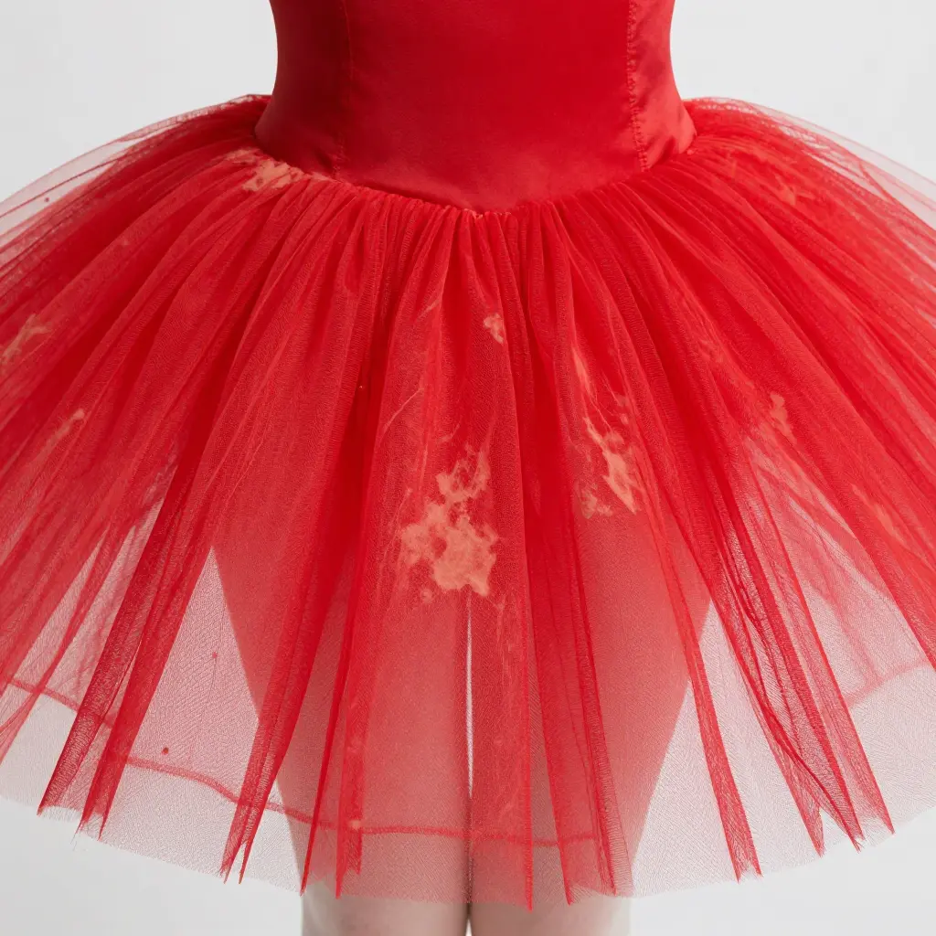
Why Red Tutus Fade Unevenly
A red tutu can look tired long before it looks worn. Pale streaks appear along the hems, one panel turns brighter than the one beside it, and the colour drifts toward orange or pink in one area while the rest stays deep. Owners usually blame washing or sunlight. Both matter, but most of the problem is decided before the tutu is sewn: tulle from more than one dye lot, stiffening finishes that change how the fibre takes dye, and colour checks that pass fabric the eye can still tell apart.
Red is unforgiving on all three counts. A shade that is only slightly off still reads as a different red next to its neighbour, so small differences that would pass unnoticed elsewhere become obvious once the panels sit side by side. If you are choosing fabric for a new piece, our ballet tutu guide covers the basics before you commit to a roll.
Why Red Is the Colour Most Sensitive to Dye Lot
A dye lot is one batch of fabric coloured in a single continuous run. Every metre of red tulle from that lot is dyed at the same time, in the same vat, at the same temperature and with the same chemical recipe, so it should match. Tulle makes this harder than it sounds. It is a featherweight open mesh with an enormous surface area for its weight, and yarn that fine spends more time in contact with the dye bath, so a small change in that bath shows up in the finished cloth.
Red is difficult to hold on target from lot to lot. Dyers work to a narrow tolerance, and the reds used on tulle come from several chemical families, each with its own behaviour in the bath and its own resistance to light. Some reds are among the more lightfast dyes in use; others sit low on the blue wool scale. Two rolls ordered months apart may not match on the spool, and the difference is easy to see once the garment is assembled.
Fading adds to the problem. Lightfastness is a property of the specific dye, not of the colour itself, so the useful question is not “how fast does red fade” but “which dye was used, and what is its rating.” On an open tulle net, light reaches almost every fibre, and the thin exposed edges of each layer take the most wear, so a red tutu often fades unevenly within a single panel rather than all over at once. A paler shade such as a pink tutu is not automatically safer. Pastels are dyed at low concentration, and small differences in depth are often harder to reproduce in a pale cloth than in a deep one.
Mismatched dye lots and uneven fading show up in a few recognisable ways:
- Mismatched panels – a skirt built from two lots shows a hard colour line where the layers meet.
- Streaky hems – the thin, exposed edge of a tulle layer fades fastest, leaving a pale rim against a deeper body.
- Visible seams – where freshly cut pieces meet older stock, the join reads as a darker or lighter stripe straight down the garment.
The fix is discipline rather than chemistry: buy enough red tulle from one dye lot to finish the whole red tutu, keep leftovers out of the light, and colour-match by eye under daylight before you cut.
The table below is a quick reference for the variables that make one red tulle fade differently from another. It is useful when you are already comparing pink tutu shades across dye lots.
| Dye Lot Variable | Example Red Shade | Likely Fade Pattern | Risk Level |
|---|---|---|---|
| Dye concentration | Deep scarlet (heavy dye load) | Fades to orange or pink patches | High |
| Dye batch number | Crimson, Batch A vs Batch B | Mismatched panels, uneven tone | High |
| Fabric pre-treatment | Scoured vs unscoured tulle | Blotchy, streaky lightening | Medium |
| Immersion method | Dip-dyed vs exhaust-dyed | Gradient fade along hems | Medium |
| Finishing temperature | Low-heat set vs high-heat set | Low-temperature sets fade first | High |
| Storage conditions | UV-exposed vs shaded rolls | Sun-facing edges pale fastest | Medium |
How Tulle Stiffness Changes Dye Absorption and Fade
Starch, resin and other stiffening finishes give tulle the crisp stand that makes a red tutu hold its shape. The same treatment changes how dye behaves in the cloth. A stiffening agent forms a film around each yarn and fills the gaps between filaments, so the dye bath cannot reach the core of the fibre. Depending on when the finish is applied, it either blocks the dye outright or sits on top of the colour already there; either way, the outer surface of the yarn carries most of the colour and takes most of the wear.
Mesh density and yarn twist add to the effect. A dense tulle with tightly twisted yarns has smaller openings, so the bath penetrates unevenly and leaves some strands saturated and others barely tinted. A swatch matched on soft, loose tulle will often read differently once the finished garment is stiffened, which means the same dye lot can look like two different reds on the rack. That is why colour matching belongs early in production rather than at the end. A designer working through these details will find more in our tutu dress and skirt insights.
Three mechanical factors account for most of the unevenness:
- Stiffening agent film – the coating slows dye migration, concentrating colour near the surface where it fades first.
- Mesh density – tighter weaves leave smaller openings, so dye reaches inner fibres unevenly and creates streaky saturation.
- Yarn twist – high twist compacts filaments, limiting capillary uptake and making penetration depth inconsistent across the panel.
Together, they explain why a stiffened red tutu loses colour in patches rather than in a smooth, even fade.
How Tulle Stiffness Shapes Dye Distribution
The difference between soft and stiff tulle comes down to how far the dye travels. In a soft, loosely twisted yarn, the bath moves through the gaps and saturates the fibre core, so the colour sits locked in an even tone. In a stiffened, tightly packed yarn, the filaments are squeezed together and coated with sizing, and the dye barely moves past the surface. Friction, light and washing then strip away the shallow layer first.
That is why a single tutu can look richly saturated in one panel and washed out in another, even when both panels came from the same dye lot. Costume designers and buyers get better results when they match the tulle to the job: soft mesh for pieces that will be handled and cleaned often, stiffer mesh where shape matters more than long-term colour.
Colour Matching Checks Every Maker Should Run
A mismatched red tutu rarely fails on stage by accident. It fails at the bench. These checks take an hour or two and save rejected batches later. For how dye and construction interact on tulle, see these skirt construction insights.
- Verify the dye lot number on every roll. Dye lot codes tell you whether two pieces of fabric were coloured in the same vat, and even a small number difference can shift a red several shades. Match lot numbers before you plan a single panel.
- Run a lab dip before committing to bulk. A lab dip is a small, controlled swatch dyed to your target shade, letting you approve the exact colour under real conditions. Skipping it means discovering the mismatch only after a full batch is dyed.
- Compare panels under daylight and indoor light. Reds are notorious for shifting between cool daylight and warm tungsten, so hold your swatches side by side in both settings. What looks uniform indoors can look uneven the moment the curtain opens.
- Check seams and layers under tension. Stretch a stitched seam and inspect it, because puckering and strain can distort how light hits the fabric and exaggerate any colour difference. Tulle especially behaves differently once it is pulled tight.
- Test wash and rub fastness before assembly. Run a wash, rub and light-exposure test on a sample to see how the dye holds up over time. Fastness testing reveals whether your red will bleed or fade long before a customer notices.
- Confirm batch consistency across all components. If your design mixes tulle, satin and lining, check that every material in the batch matches, since different fibres absorb dye at different rates. One mismatched trim can undo an otherwise flawless garment.
- Re-check after steaming or pressing. Heat and moisture can subtly alter colour, so re-inspect panels after finishing rather than trusting the pre-finish state. This final pass catches shifts that only appear at the very end.
Skipping the checks rarely saves time. It moves the cost downstream into rejected batches, re-dyed fabric, and clients who expected the red they approved.
Practical Colour Matching Methods That Work
Red is one of the trickiest colours in textiles. A red tutu assembled from different production runs can look patchy under stage lights, with some layers reading warm scarlet while others drift toward orange or pink. Matching the colour before you cut is the only reliable way to avoid it. These methods are ordered roughly by effort:
- Lab dip comparison – submit small dyed samples for approval against your reference shade before bulk dyeing ever begins.
- Spectrophotometer readings – measure reflected light numerically to catch hue shifts the naked eye tends to miss.
- Visual assessment under standardised D65 daylight – judge each sample under a consistent light source that approximates average noon daylight.
- Master swatch board – archive an approved panel from every dye lot so future batches can be checked against a physical benchmark.
Each method addresses a different failure. Lab dips and spectrophotometer readings leave a record that flags incompatible batches before they are sewn into one garment. D65 daylight removes the guesswork of shop or warehouse lighting, which can flatter or distort a red and hide real differences. A master swatch board gives you a long-term reference: when a finished red tutu comes back months later, you can hold it against the original panel and see how far it has drifted.
Used together, they cut the risk that one panel fades faster than its neighbours. If you are building a production workflow around consistent colour, our tutu skirts guide for business owners covers the quality-control habits that keep every batch on shade.
Stiffer tulle grades tend to show higher average fade levels, as the chart below shows.
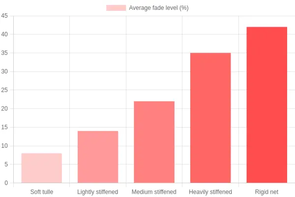
As the bars climb from soft tulle to rigid net, higher stiffness lines up with more uneven fading. That is the pattern to watch for when you are selecting tutu tulle for a costume.
FAQ
Why do red tutus fade more than other colours?
They do not always. Lightfastness is a property of the dye, not the colour, and some red dyes are as stable as any blue or black. What makes red stand out is that small shifts are easy to see, so fading and dye lot differences that would pass unnoticed on a dark navy are obvious on a red. Layered tulle adds to it: the inner layers are shielded while the outer ruffles take the full exposure. If long-term colour matters, ask the supplier for the lightfastness rating of the specific dye used.
Can dye lot variation be corrected after assembly?
Usually only partially. If the panels came from two different dye lot batches, the difference is in the fibres themselves, so overdyeing the finished piece risks stiffening it and shifting every layer at once. The realistic fixes are to reshuffle panels so the seams hide the jump, or to re-cut the most exposed ruffles from a single matched batch. Check the lot code before you assemble, because correcting it later costs far more than verifying it upfront.
Does washing speed up uneven fading?
Yes, and often sharply. Water, detergent and agitation break down dye bonds and abrade the tulle surface, and because ruffles and edges see the most friction, they fade fastest. Hot water and harsh bleach-based cleaners accelerate the process, so use cold water, a gentle detergent and hand-washing wherever possible. For how deep, saturated tones are handled in practice, see this black tutu fashion guide.
Is stiffened tulle harder to colour match?
It can be, because the stiffening agents, whether starch, resin or heat-set finish, sit on or around the fibres and change how dye and light interact with the surface. Two identical shades of tulle stiffness can therefore read as visibly different colours once the finish is applied. When you are colour matching, compare samples at the same stiffness level and under the same lighting, not against a soft swatch. If you are deciding between softness and structure, weigh how the finish will shift the final tone before you commit.
How can makers prevent uneven fading in red tulle?
Build the piece from a single dye lot, store finished garments away from direct sunlight, and rotate displays so no single ruffle faces the light permanently. Keep a small swatch from each batch for colour matching repairs down the line, since a faded panel is easier to replace than to re-dye. For long-term durability, choose pre-treated, colourfast tulle and note its lightfastness rating in your production records.
Conclusion and Key Takeaways
A red tutu fades unevenly for three practical reasons. Dye lot variation means two batches of the same shade rarely match exactly, so a garment stitched from mixed rolls can drift into patches. Tulle stiffness decides how much dye reaches the fibre core and how the surface wears. Colour matching checks catch both problems before a costume ever reaches the stage.
The habits do not change: verify the batch code, match the shade under standard light, and swatch the fabric before you cut a single layer. Do that consistently and the finished red stays the red you approved.
The same discipline pays off for everyone in the chain. Longer-lasting costumes mean fewer replacements, fewer returns, and dancers who can trust the colour under stage lights. For more on finishing a piece properly, see our adult tutu guide.